Why Text Columns Are Narrow
As someone who has always struggled with external-to-internal information transfer (whether reading or listening) the topic of line length is more interesting to me than it probably should be.
I’ve always enjoyed reading, but when I was younger I had some impatience and would skip ahead a paragraph or two only to find myself totally lost. While that’s not directly related to optimal line length, I don’t think I’m the only one guilty of jumping ahead to find out what was going to happen to Dumbledore on the astronomy tower.
My personal flavor of ADHD+ (I can’t remember what they called it, didn’t really care honestly) comes with specific difficulty in spelling, occasional trouble reading, and the not-so-occasional hyperfixation on something dumb. If you deal with similar issues, there’s an OpenDyslexic font toggle on this site.
Today it’s optimal line length for reading English, brought on by trying to figure out the best width for this very page.
The Perceptual Span
Turns out plenty of researchers have studied this. I found a paper on eye movement timing in relation to horizontal travel: “Eye movements in reading: Implications for reading subtitles” by Elizabeth R. Schotter and Keith Rayner.
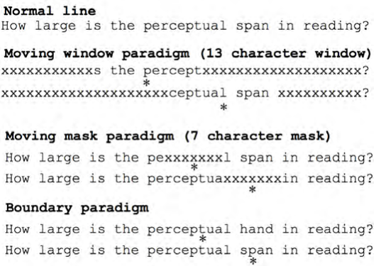
It contained an interesting illustration of the perceptual span (the region of effective vision during reading).
We intuit that we see an entire line of text clearly, but experiments using the gaze-contingent moving window paradigm demonstrate that readers access little information outside a small window around the fixated character.
The experiment works like this: imagine a window of visible text moving left to right, exposing more characters as it grows. By measuring eye movements as readers encounter larger windows, researchers can determine how many characters fall within effective vision.

The finding: For English readers, only 3-4 characters to the left and 14-15 to the right of the fixation point are within this focal region.
That asymmetry is telling. Our perception literally leans right (already hunting for the next word before we’ve finished the current one).
No wonder I skipped ahead to the astronomy tower. I was not built different.
Why This Matters for Line Length
So if our effective window is only ~18 characters wide, what happens on a 120-character line?
A lot of jumping.
When your eye hits the end of a long line and swings back to find the next one, it tends to undershoot (landing a few characters in rather than at the start). Your eye makes a small correction. On short lines, no big deal. On long lines, this happens over and over. You lose your place. Re-read a phrase. Get tired without knowing why.
This is why 45-75 characters keeps showing up in typography advice. It’s not some designer’s aesthetic preference. It’s roughly 3-4 comfortable eye-jumps with clean return sweeps.
Historical Intuition
Printers figured this out centuries before anyone had an eye tracker.
Gutenberg’s Bible? Two columns. Not because it looked holy (because it read easier). Monks had been doing the same thing in manuscripts forever.
Newspapers landed on narrow columns for the same reason (plus ads fit better around them). Books settled on ~4 inch text blocks. At normal font sizes, that’s 60-70 characters.
The early web inherited this by accident. 640px screens didn’t leave room for wide text. When monitors got bigger, some designers kept the narrow measure. Others just filled the viewport. You’ve seen those sites.
So, 720px?
For this page, I went with 720px max-width. At 15px font size, that’s around 75-80 characters per line once the gutter eats into it. Slightly wide, but still in the acceptable range.
Took me way too long to pick a number. But now I know why it works, not just because reddit said so.
Left to Wonder
This research is all based on English (left-to-right, Latin alphabet). I wonder how different it is for languages with other reading patterns. Right-to-left scripts like Arabic or Hebrew. Top-to-bottom like traditional Japanese. Character-based systems like Chinese where a single glyph carries more meaning than a few Latin letters.
Does the perceptual span flip for RTL readers? Shrink for denser scripts? And if reading patterns shape how we process visual information, what else does that affect beyond text on a page?
And what was the perceptual span even for before written language? It had to exist already. Did we just map a new skill onto existing wiring?
Probably another 1AM rabbit hole.
